


September 05, 2013 -- When we worked with the Center for Disease Control and Prevention (CDC), to build the Interactive Atlas of Heart Disease and Stroke, we knew it would serve as a great resource for anyone wanting geographic and demographic information related to heart disease and stroke. Their goal was to provide public health leadership to improve cardiovascular health for all. And the atlas would help identify places that bear the greatest burden of cardiovascular disease and potential causes, an early step towards tailoring resources and interventions to the needs of specific geographic areas.
The project goals were to provide a new internal and public access interactive web mapping application for the display of heart disease and stroke data as well as their risk factors and related data. This involved an improved user interface experience and simplified data management.
With over 20,000 hits since January from all 50 states and 100 countries, the project is a success. To recognize the CDC's dedication and work to help prevent heart disease; Esri presented them with the 2013 SAG Award at their Annual User Conference in San Diego.
Recently, researchers at the CDC published a report showing that out of 800,000 cardiovascular deaths each year, as many as 200,000 of the deaths could have been prevented if people had made health-related improvements to their lifestyle. But one thing the report noted was that the rates of preventable death from heart disease and stroke were highest in the South, indicating that longevity may have more to do with your ZIP code rather than your genetic code.
With the highest rates of preventable death from heart disease and stroke concentrated in the South, it’s easy to visualize this finding within the Interactive Atlas application. The map below represents the report’s findings.

The map allows users to select geographic areas to view, either by state, U.S. map with state data, or U.S. map with county data with the ability to pan and zoom to specific areas of the map. Various health Indicators can be selected if users want to view map data based on all heart disease, coronary heart disease, acute myocardial infarction, cardiac dysthymia, heart failure, hypertension, all stroke, ischemic stroke, hemorrhagic stroke, and preventable/avoidable death.
Users can then filter by race/ethnicity, gender, age, year, and spatial smoothing. Other options can be selected to display on the map including determinants of health, for example social environment, race/ethnicity, and physical environment. If a user wanted to view available health services on the map like hospitals and pharmacies, they have that option. Users can also overlay the map to show healthcare facilities, roads and cities, and other boundaries.
Another useful feature is the ability to view two maps side-by-side for the purpose of comparison. So if you wanted to visualize the heart failure death rate in Alabama for men versus women, you could easily switch it to view one map showing data for men and another map showing data for women.

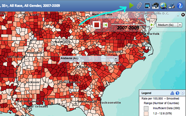
And if that isn’t enough of a cool feature, the map has the ability to animate so that users can view historical data over time. This is achieved by clicking the play icon on the map toolbar, shown in the screenshot below.
What’s intriguing about the interactive map, is not only what it shows, but the technology behind it. The CDC atlas is a Flex application that consumes map services from ArcGIS Server 10. The data is housed within SQL Server.
The application also consists of a web service (WCF) that provides health and demographic data, which is dynamically bound to spatial boundaries on the client. The Flex app loads the county and state boundaries during startup and retrieves health and demographical data from the web service, as needed per the criteria chosen by the user.
The app also uses a custom configuration schema that allows for easy updating and maintenance of the data by CDC.
It is exciting to see this application put to great use and really providing that spatial insight that makes it a little easier to understand the new reports the CDC released to the public. And since we’ve spent enough time playing around with the application and zooming in and out of areas on the map, namely our hometowns, we’re thinking it’s time to start making some health improvements. Maybe company meetings on the b-ball court? Could be a start!


 Animation, 3D Art and 3D Models")